下載 APKPure App
可在安卓獲取Learn Advanced Excel Charts的歷史版本


高級Excel圖表
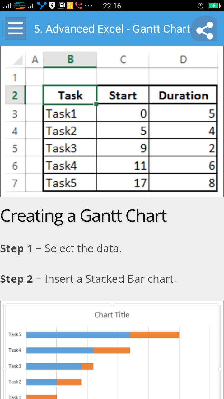
Excel charts are an efficient means to visualize the data to convey the results. In addition to the chart types that are available in Excel, some application charts are popular and widely used. In this tutorial, you will learn about these advanced charts and how you can create them in Excel.
This guide targets people who want to use graphs or charts in presentations and help people understand data quickly. Whether you want to make a comparison, show a relationship, or highlight a trend, these charts help your audience “see” what you are talking about.
Among its many features, Microsoft Excel enables you to incorporate charts, providing a way to add visual appeal to your business reports.
Before you proceed with this tutorial, we are assuming that you are already aware of the basics of Microsoft Excel charts. If you are not well aware of these concepts, then we will suggest you to go through our short tutorial on Excel charts.
Last updated on 2018年02月23日
Excel charts are an efficient means to visualize the data to convey the results. In addition to the chart types that are available in Excel, some application charts are popular and widely used. In this tutorial, you will learn about these advanced charts and how you can create them in Excel.

Learn Advanced Excel Charts
1.2 by Free Book Apps
2018年02月23日